
DETAILS
This was a class project and not affiliated with Crows Nest Barbershop. In my Brand and Identity systems course, we were assigned a regional brand and were given the task to design an original new logo for the company. Furthermore, we had to develop the brand identity through several exhaustive rounds of ideation with thumbnails and tight pencils. Our final concept was refined through digital production and applied to five distinct settings that were relevant to the assigned client.
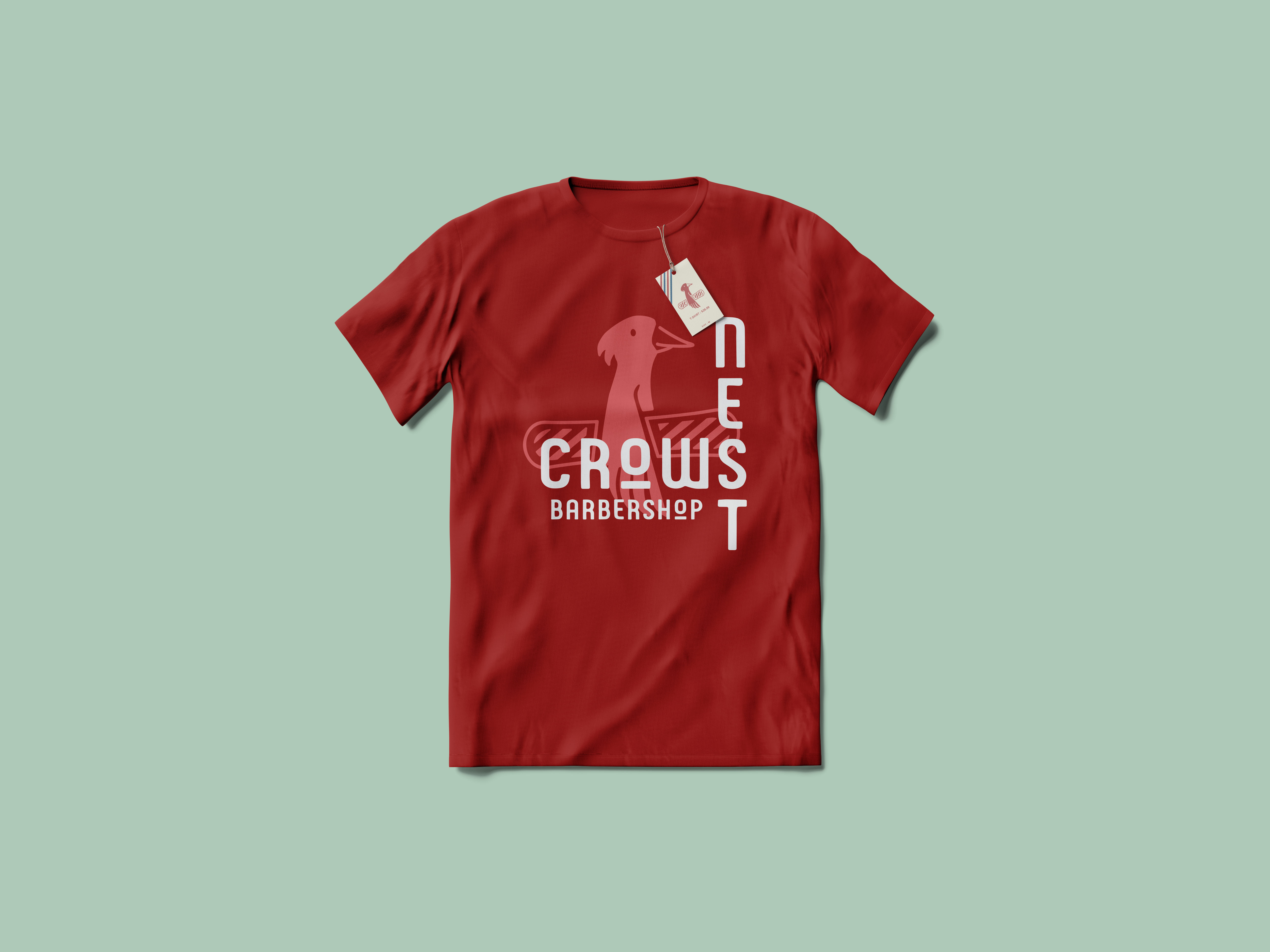
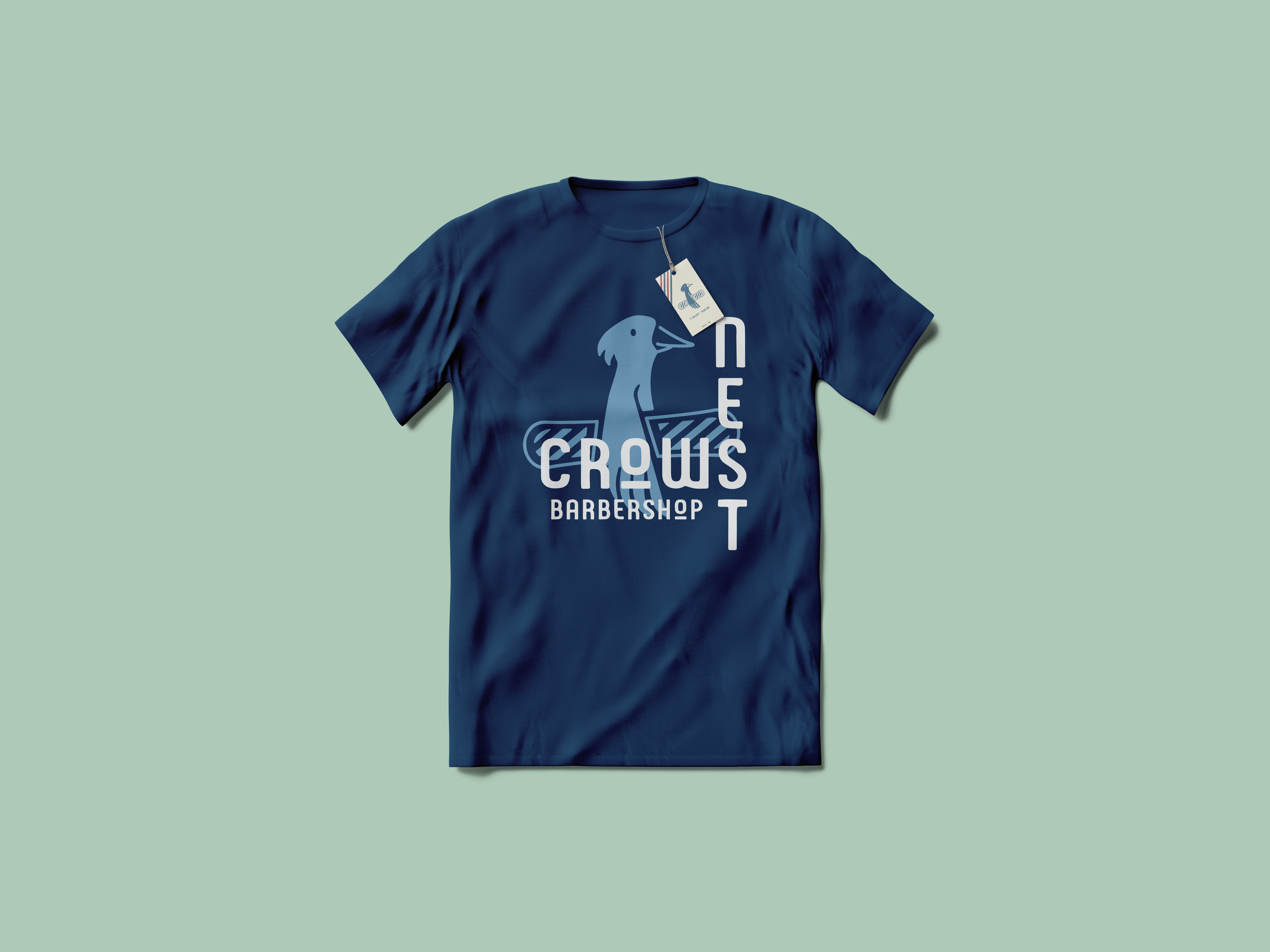
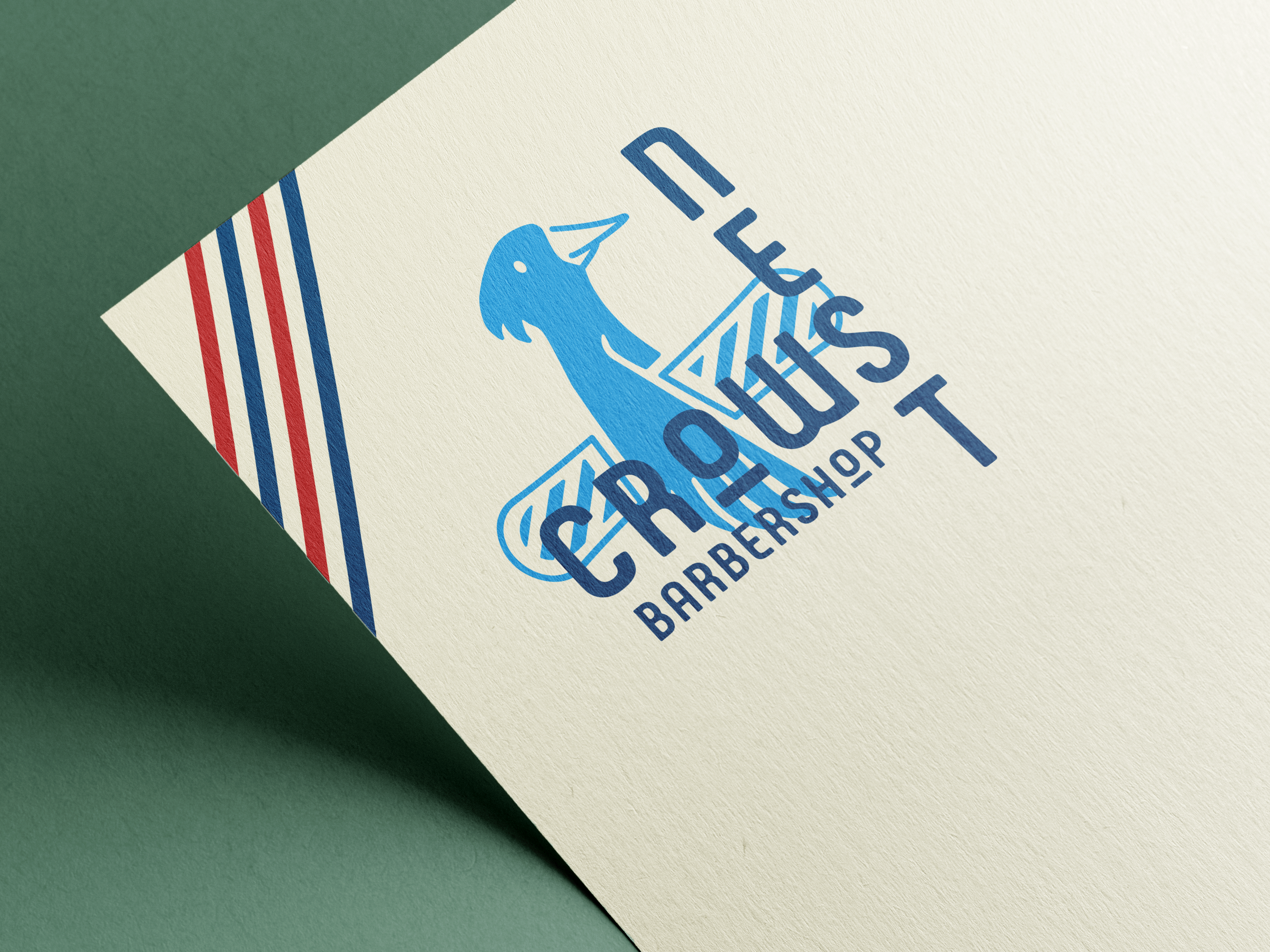
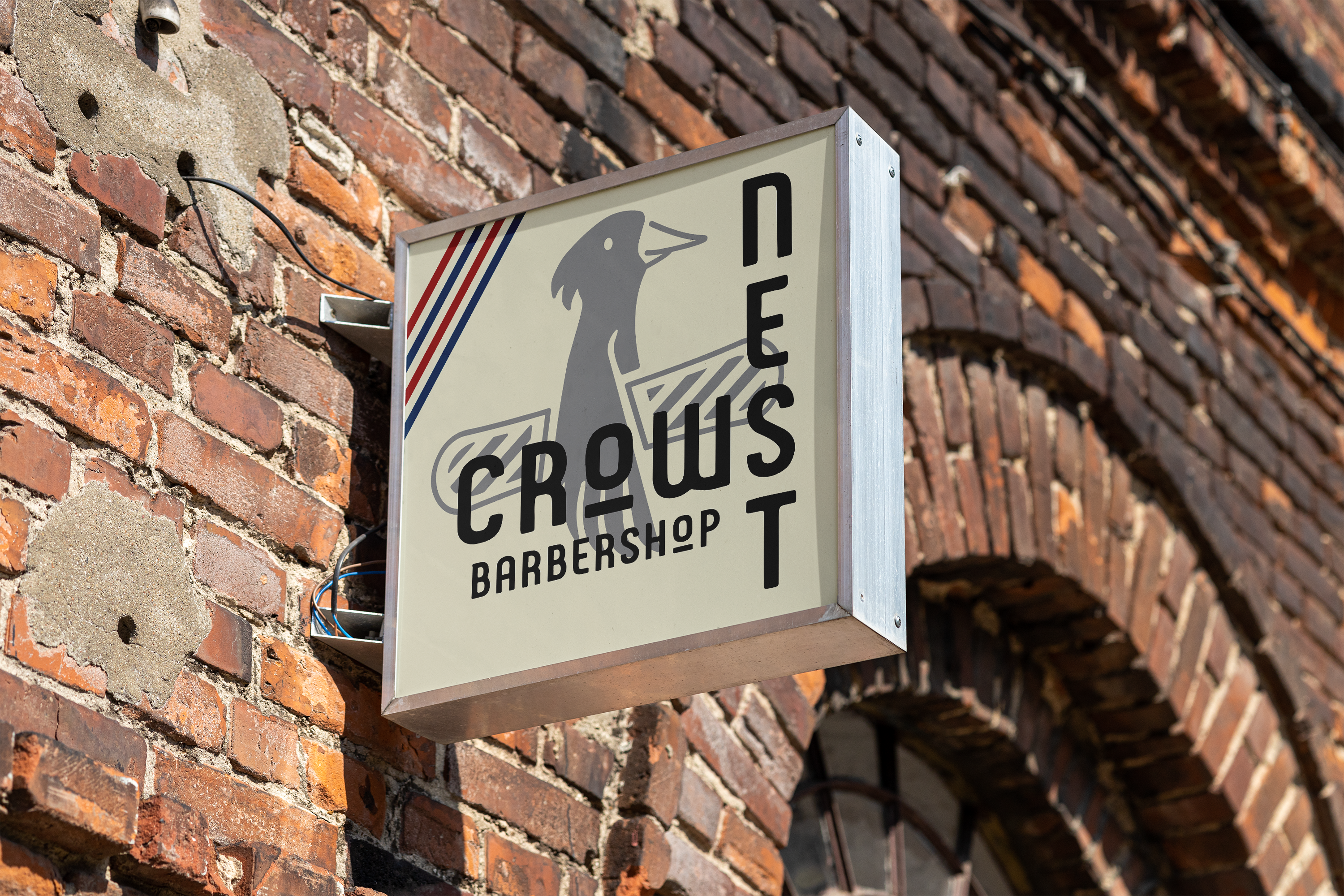
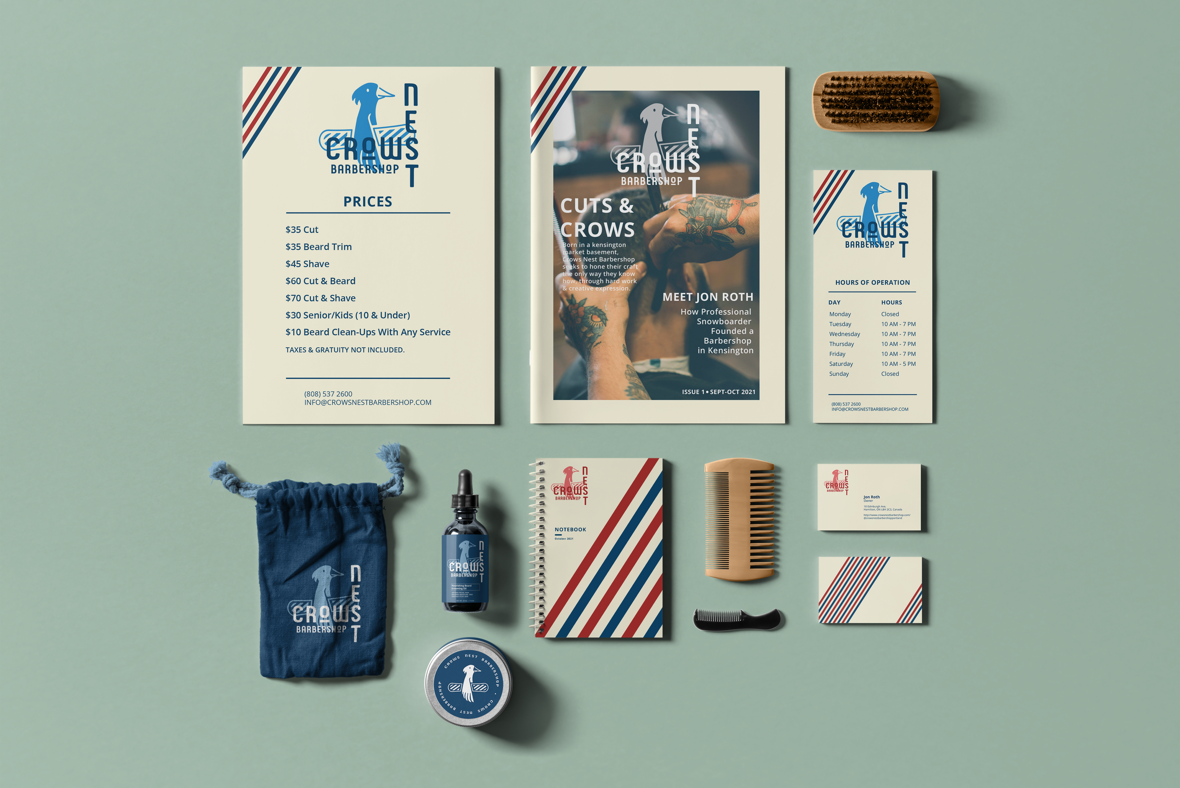
For my rebrand of Crows Nest Barbershop, I wanted to communicate their sincere and real origins about the shop being born in a Kensington Market basement in Toronto and the owner’s affiliation with being a snowboarder. The aim was to convey the community’s authentic, cool and young spirit through their brand identity system as well as reflect a trustworthy and hard-working location in the community.
YEAR
2021
PROJECT
- Adverts
- Brand Identity
- Graphic Design
Context
Crows Nest Barbershop (CNB) was born out of the necessity of Jon Roth, who was a professional Snowboarder, looking for a new job. At that point, in Canadian Nouveau barbering history, there was no place he could express his own creative expression. However, in his friend’s basement, Jon and a couple of his close friends could hone their craft and eventually create a business.
Setting
Crows Nest Barbershop is located right in the heart of Kensington Market, Toronto. The area is a distinctive multicultural neighborhood consisting of immigrant communities. The market itself is eclectic and bohemian and has become a hot spot for tourists and a popular shopping destination.
Brand Audit


- Eclectic and odd style but very authentic to the people who work there.
- Staff consists of many tattooed individuals with piercings or beards.
- There are snowboards referencing the owner’s past profession as a professional snowboarder
- The bathroom gives you a sense of the decor and is authentic to the owner’s passions as if it was his own bedroom.
- Crows Nest also currently has a social media presence and keeps it consistent with their logo.
- The colors they primarily use are yellow and blue, and it has a sense of art nouveau/art deco.
Brand Vision
SPIRITED
Crows Nest Barbershop should convey the community’s authentic, cool and young spirit through their brand identity system.
RELIABLE
Crows Nest Barbershop should reflect a trustworthy and hard-working location in the community that makes customers feel comfortable choosing you over the competition.
HONEST
Crows Nest Barbershop should reflect their sincere and real origins about the shop being born in a Kensington Market basement in Toronto.
Colors
Firebrick
#ac2c22
Cornsilk
#F6F2D6
Indigo Dye
#0B436B
Cambridge Blue
#ADCAB8
Fonts
Open Sans
A B C D E F G H I J K L M N O P Q R S T U V W X Y Z
a b c d e f g h i j k l m n o p q r s t u v w x y z
A B C D E F G H I J K L M N O P Q R S T U V W X Y Z
a b c d e f g h i j k l m n o p q r s t u v w x y z