Our Lady of the Road is an organization that seeks to serve those on the margins of the South Bend community (https://www.olrsb.org/). They were recently in need of a new website to engage with the different members of the South Bend community such as volunteers, city council members, and those who need aid (ex. the houseless). I, alongside 2 other students, had the opportunity to work on this actual client project. As a team, we performed user research, user flows, wireframes, and prototypes in an 8-week sprint.
MY ROLE
UX Designer. Research, design, workshopping, interviewing, prototyping.
PROJECT
Our Lady of the Road
TIMELINE
8 Weeks (2022)
TOOLS USED
Miro, Figma, Premiere,
OVERVIEW
Design Process

Context
Our Lady of the Road, inspired by the Catholic Worker Movement, serves marginalized individuals through hospitality in men's and women's houses with no set stay limit. This led to Motels4Now, a low-barrier housing program for the chronically homeless. They also offer events like film screenings, produce markets, and beekeeping workshops.
Stakeholders
- Committed volunteers in this faith/community-based organization that seek to help homeless needs like housing, hunger, and health.
- Individuals who look towards this organization for assistance with needs like housing, hunger, health, and utilities
Need / Motivation
- Assistance for the homeless should not just include food and shelter, but also services such as showers and laundry.
- There is an urgent need for accurate and accessible online information for those in need of aid for housing, food services, utilities, etc from the organization.
Part 1: Problem
Discover
We identified key insights, pain points, and design opportunities by observing users interact with the site and conducting interviews and ethnographic research.
Explore and Define
After defining the problem, we pitched solution ideas and used convergent thinking to identify user needs and opportunities.
To grasp the community’s needs accurately, the team visited Our Lady of the Road on Sunday morning, equipped with pre-prepared questions. These questions covered topics such as device usage, website access situations, and top tasks. The team identified current website weaknesses, but it was crucial to understand stakeholders’ perspectives. In addition to questions, interviewees navigated the website, sharing their experiences and preferences. Our Lady of the Road caters to a diverse community facing various challenges. Recognizing this, the team prioritized introducing themselves, seeking consent for interviews and photos, and tailoring their approach to the community’s context. Building trust was essential, as the community, familiar with University of Notre Dame volunteers, required clear motivations for genuine and helpful data collection.

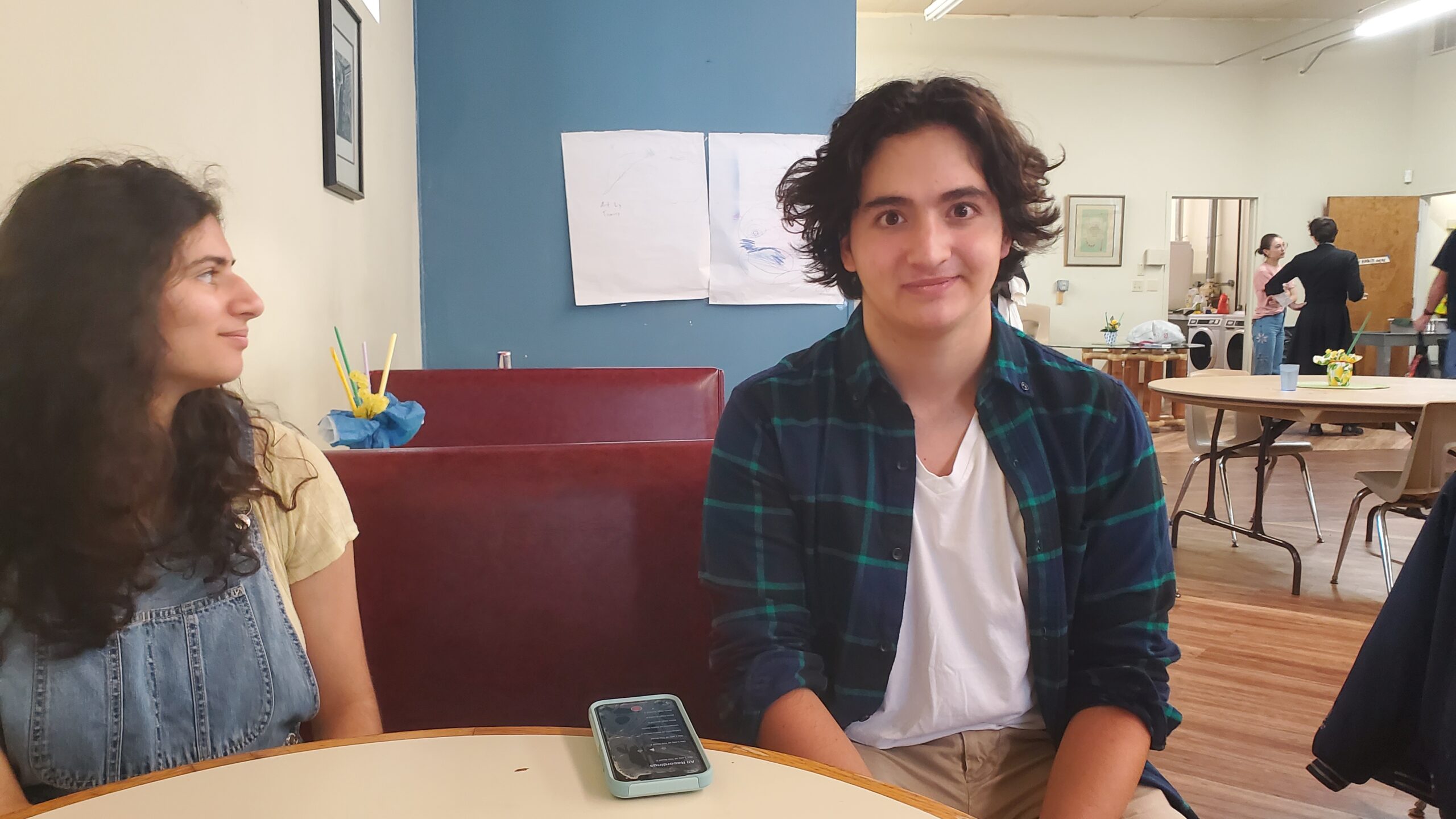

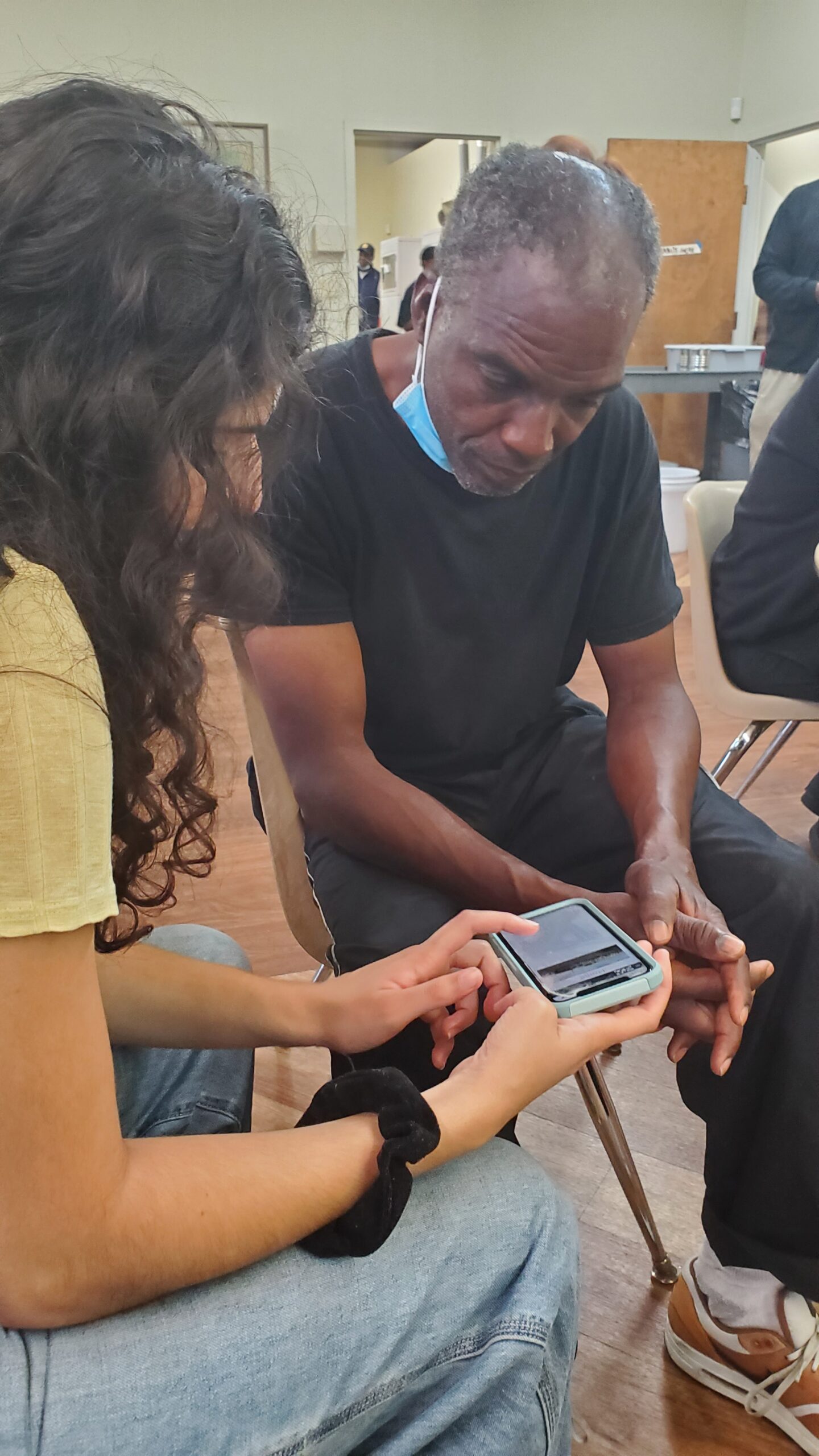
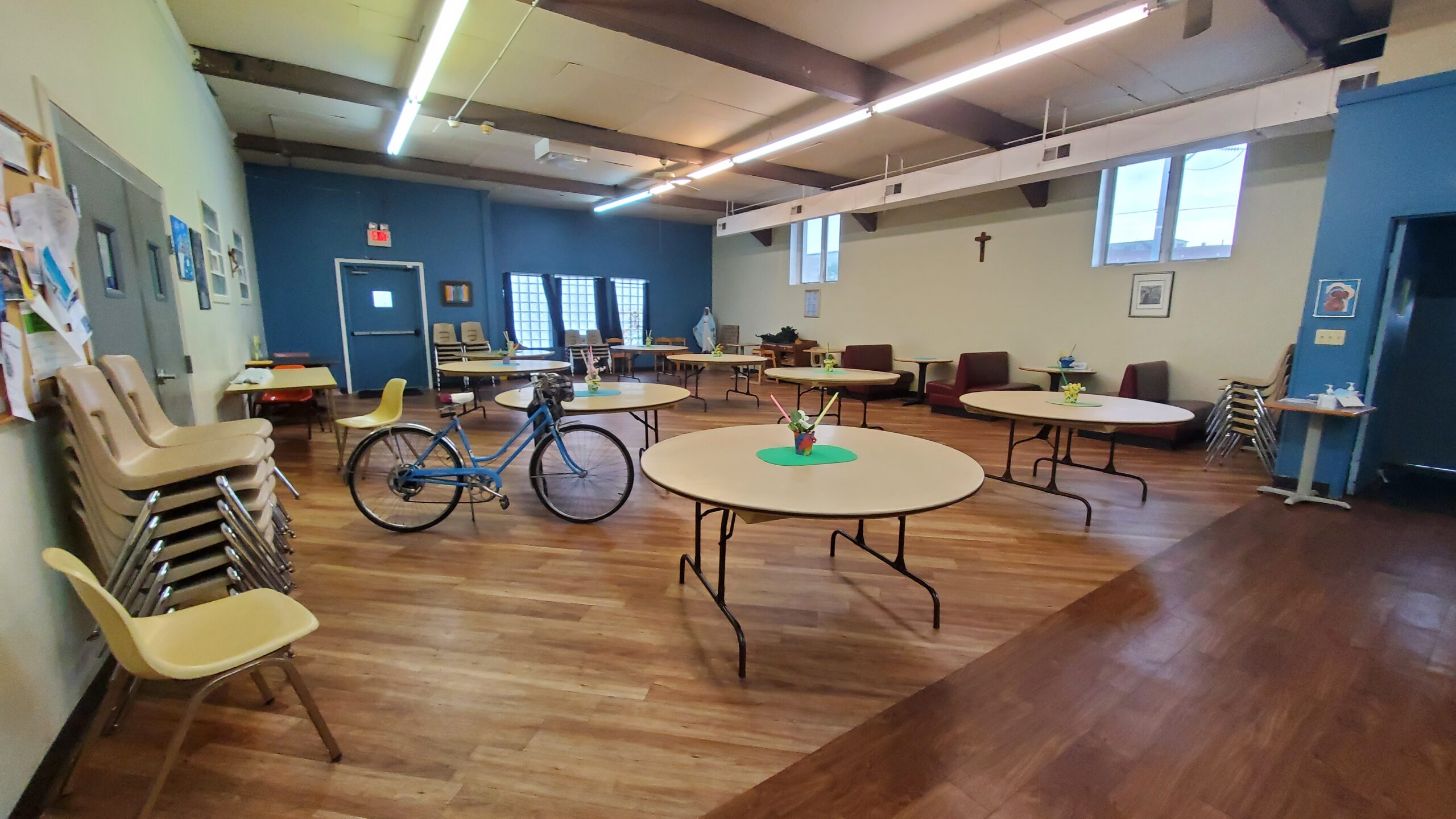
The team identified the need for a new website at Our Lady of the Road through the University of Notre Dame’s Computer Science for Good club and past involvement with Motels4Now. Collaborating with Notre Dame affiliates and courses, the focus was on the Motels4Now initiative. However, after interviews and community observation, a holistic approach was necessary. Affinity diagramming revealed additional issues, including the need for better information dissemination and volunteer coordination. The website redesign should address general information, resource promotion, a dedicated volunteer section (including donations), and a dashboard for various initiatives, including Motels4Now.
EXPLORING DATA AND INSIGHTS
Mapping Thoughts on Affinity Diagram

DEFINING PERSONA & GOALS
Consolidating our key insights into 2 goal-oriented personas.


DEFINING PERSONA & GOALS
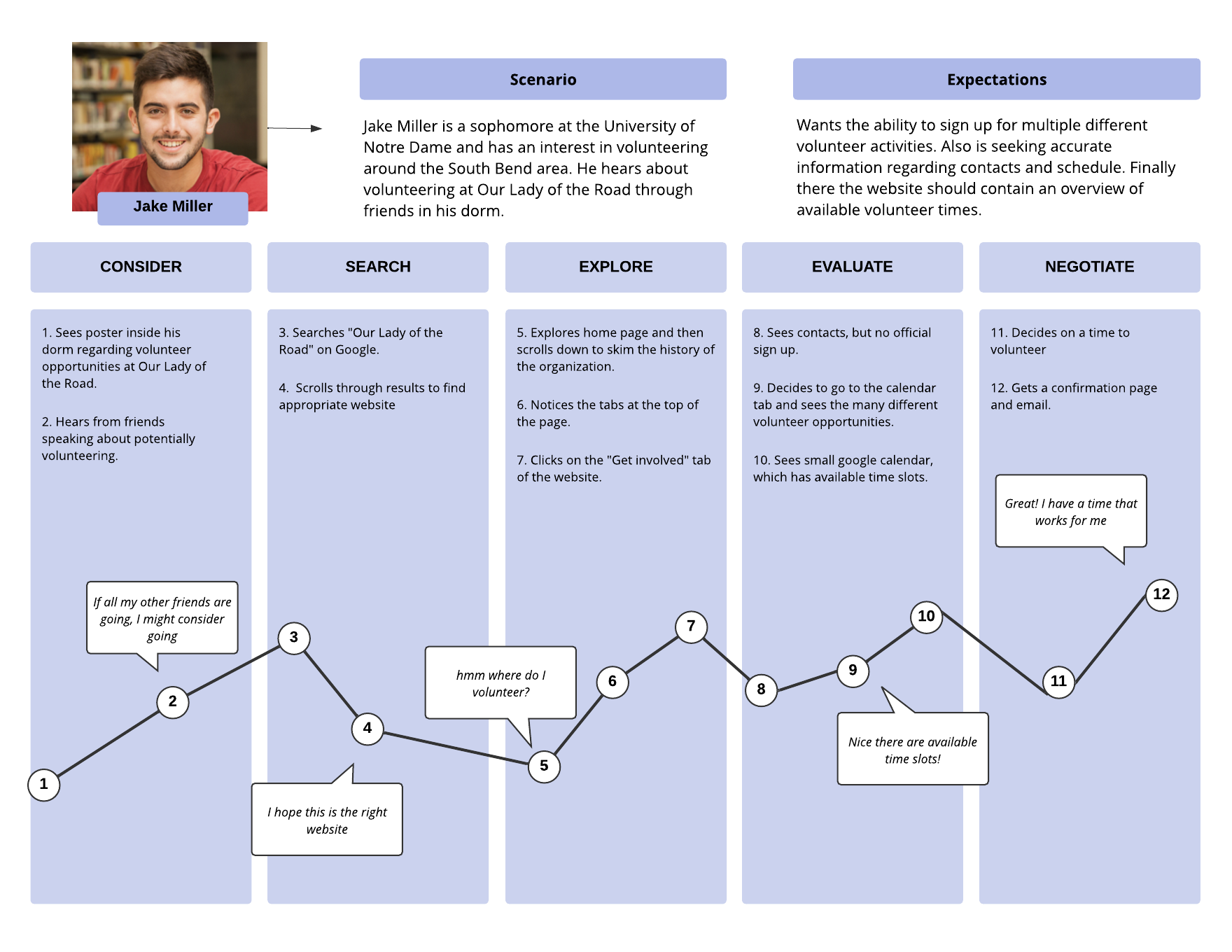
Defining a User Journey
Our primary persona is Jake Miller, a University of Notre Dame student seeking volunteering opportunities in South Bend. Interviews reveal word-of-mouth as the primary way volunteers learn about Our Lady of the Road. However, due to its fleeting nature, volunteers often turn to the organization’s website for more concrete information. Jack’s volunteer journey involves wanting to learn about local organizations and services to address homelessness and organizing his volunteering around his schedule. The current website offers outdated information, unclear registration, and lacks details about volunteer tasks. This inefficiency can lead to frustration, causing potential volunteers like Jack to disengage from the organization, hindering community-strengthening efforts.
DEFINING PERSONA & GOALS
Jobs-To-Be-Done (Volunteering for Service Work)
Functional Criteria (Objective)
There should be more information on how to get involved as well as an accurate signup space for certain days when the organization needs more volunteers. Moreover, reduce the clutter of information in the user interface.
Emotional Criteria (Social)
You should not feel like you’re unhelpful in full volunteer work and rather feel like you are contributing to a team. There should be contacts available to reach out to for questions/concerns.
Emotional Criteria (Personal)
It should be a comfortable process and should not be confusing or stressful figuring out the available times. Users should be treated respectfully and enjoy the service work that they would be providing.
PROBLEM STATEMENT
Millions of students face challenges volunteering due to tight schedules, leading to fewer volunteers on critical days. Our goal is to create a web-based app that addresses these issues by providing easy access to information on volunteering opportunities and schedules.
Part 2: Designing Solutions
Develop and Test
During our development stage, we explored many concepts and iterated on concepts that needed further development. We utilized methods such as brainstorming, visualization, prototyping, testing, and scenario development.
Deliver and Listen
In our delivery stage of the design, we examined our final concept with final testing. Some methods include a final testing prototype with a usability study, heuristic evaluation, and a demo to showcase our product.
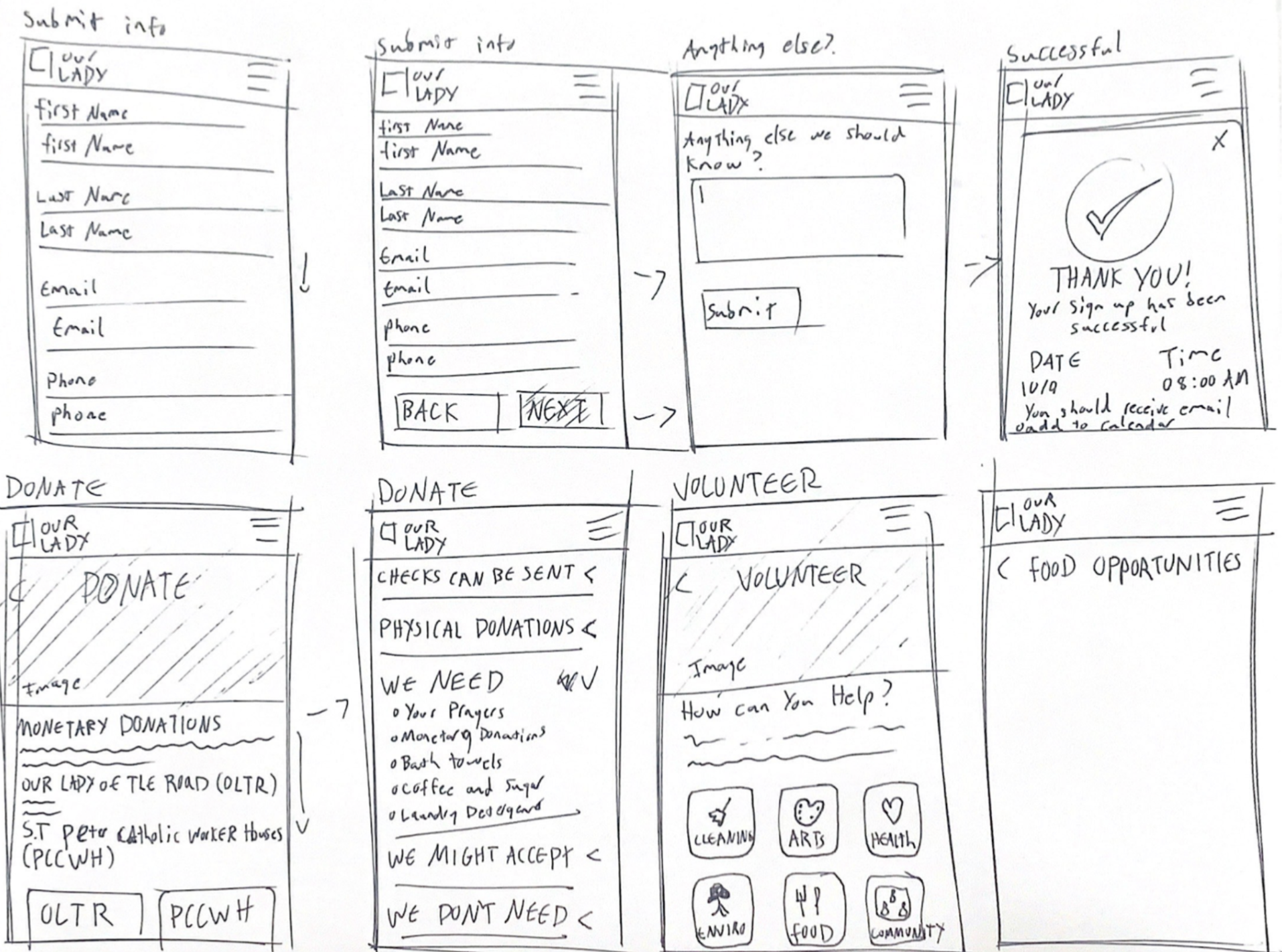
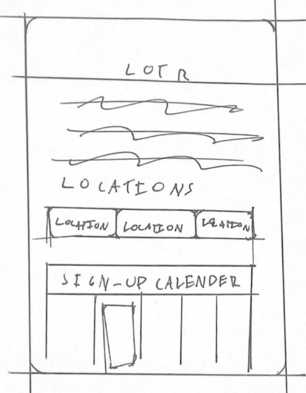
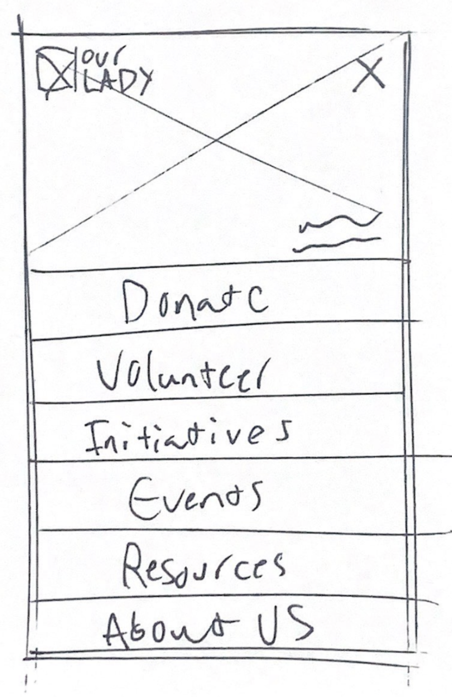
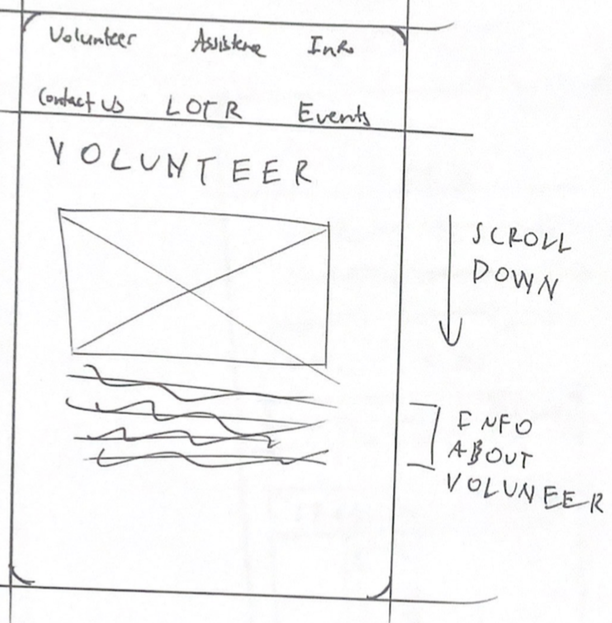
Following the Double-Diamond design model, each team member created low-fidelity prototypes for Our Lady of the Road’s website. We then collaboratively identified necessary features through discussions and insights from interviews. To refine the prototype, we converged on a shared vision, with some focusing on a web-based phone prototype, emphasizing volunteer sign-up and homepage structure, and another member on a desktop UI design. Interviews highlighted the majority accessing the site through mobile phones, leading us to prioritize a mobile web-based application. We selected crucial features based on the existing website, individual prototypes, and interview insights, addressing the target users’ primary needs when accessing the site.





DESIGN CONCEPT
Visual Identity
We came up with a design system to add consistency, structure, and communication among all team members. The entirety of the web application follows a minimalist design scheme with Josefine Sans as the typeface, a greyscale color scheme with a #5E74D4 accent color, and a consistent 24/16/14/11px font scale. We chose this shade of blue as it would be perceived as dependable and trustworthy by visitors. The typeface is a sans serif typeface to signify a modern and humanist approach to our interface. We also implemented friendly icons to bring some fun and enjoyment to the app.
#5E74D4
#FFFFFF
Josefin Sans Bold
Aa
A B C D E F G H I J K L M N O P Q R S T U V W X Y Z
a b c d e f g h i j k l m n o p q r s t u v w x y z
Josefin Sans Regular
Aa
A B C D E F G H I J K L M N O P Q R S T U V W X Y Z
a b c d e f g h i j k l m n o p q r s t u v w x y z
Josefin Sans Light
Aa
A B C D E F G H I J K L M N O P Q R S T U V W X Y Z
a b c d e f g h i j k l m n o p q r s t u v w x y z

USER TESTING
Usability Testing


USER TESTING
Usability Testing Results
The survey results indicate overall satisfaction, with 100% of participants finding the design easy to use. Responses to difficulty or weakness questions were exclusively in the ‘Strongly Disagree’ and ‘Somewhat Disagree’ range, while questions on ease of use and positive design received ‘Strongly Agree’ and ‘Somewhat Agree’ responses. Participants expressed an instinctive familiarity with the components, enhancing efficiency without the need for prior learning. Notably, a participant highlighted the convenience of images, especially for those with English as a second language. This insight emphasizes the potential benefits of a multilingual web application to accommodate the diverse South Bend community, including Spanish speakers and those unfamiliar with certain products or conventions.


FINAL DESIGN
Demo Video
REFLECTION
The team streamlined the development of the final usability study for the prototype by synthesizing tasks from individual plans. This process, akin to the earlier Double-Diamond design approach for the low-fidelity prototype, efficiently integrated diverse ideas and perspectives. The project, encompassing user research methodology and an iterative, structured process, provided valuable insights into designing for different user bases and creating a human-centered, quality solution in service of a good cause.
NEXT STEPS
01
Explore website platforms to implement high-fidelity designs and user feedback.
02
Address issues and iterate by identifying any issues or pain points reported by users.
03
Conduct more rounds of testing to further iterate and refine the structure, content and visuals.

