
DETAILS
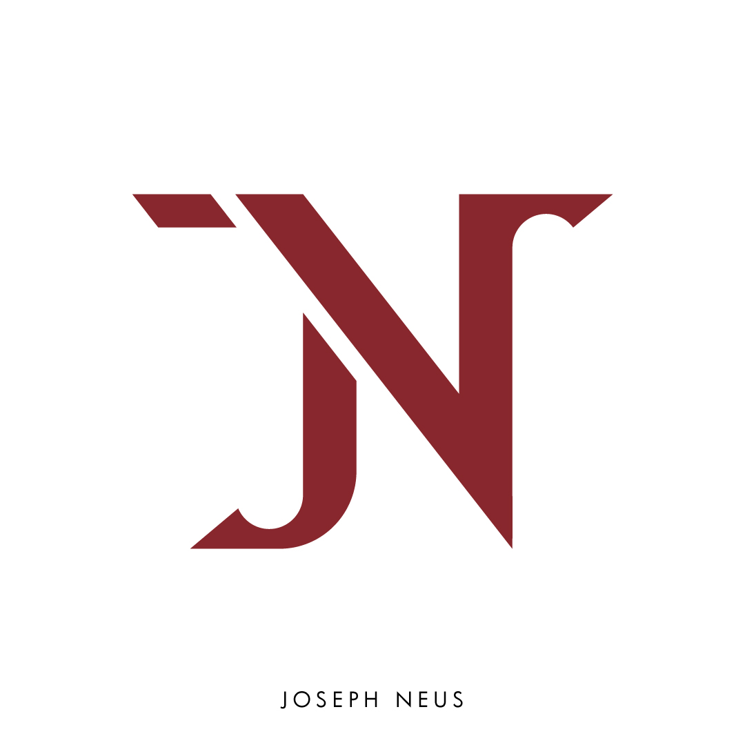
For our typography class, we were asked to develop a monogram of our own initials. My initials are JN. For my monogram, I explored various typefaces that evoked a bold and clean appearance. To reflect my personality, I leaned more towards the typefaces that were organized and direct. When examining typefaces, I also looked at how they use different line weights and serifs. In my experimentations, I utilized a grid structure, incorporated parallel line directions, and balanced negative and positive space. I wanted to achieve a diagonal, geometric and bold composition as my final product. My final design was inspired by the typefaces Hudson, Jawbreak, and Areno.
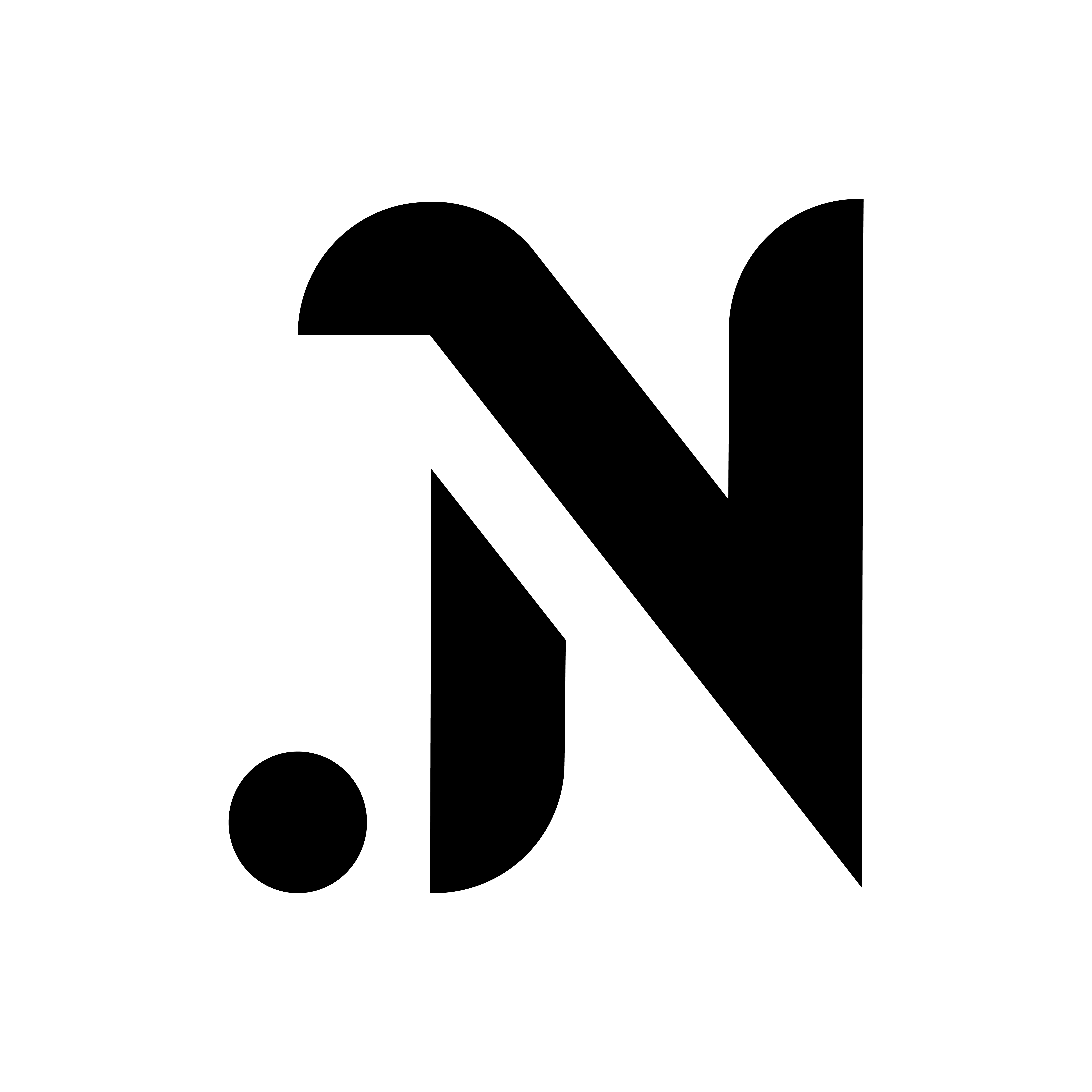
In 2021, I reflected back on my monogram and decided to refine my monogram further as I thought that there were some areas of improvement. Simplicity can help create balance and impact and therefore, I thought my monogram could be succinct and simplified. I retained some elements from my previous design such as the parallel line directions and geometric composition but also incorporated rounded edges and experimented with having cohesive line thickness. My final product feels more refined and concise.
YEAR
2020-2021
PROJECT
- Graphic Design
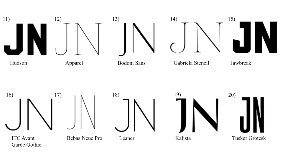
I began my project with a mood board slide deck that included 20 typefaces
and 20 monograms that I believe have a connection to myself as a person or designer.

I then began explorative sketches from selected typefaces that I believed would work for my monogram.


I narrowed my thumbnail sketches to a select few that I believed were compelling and modified it further by creating comps.

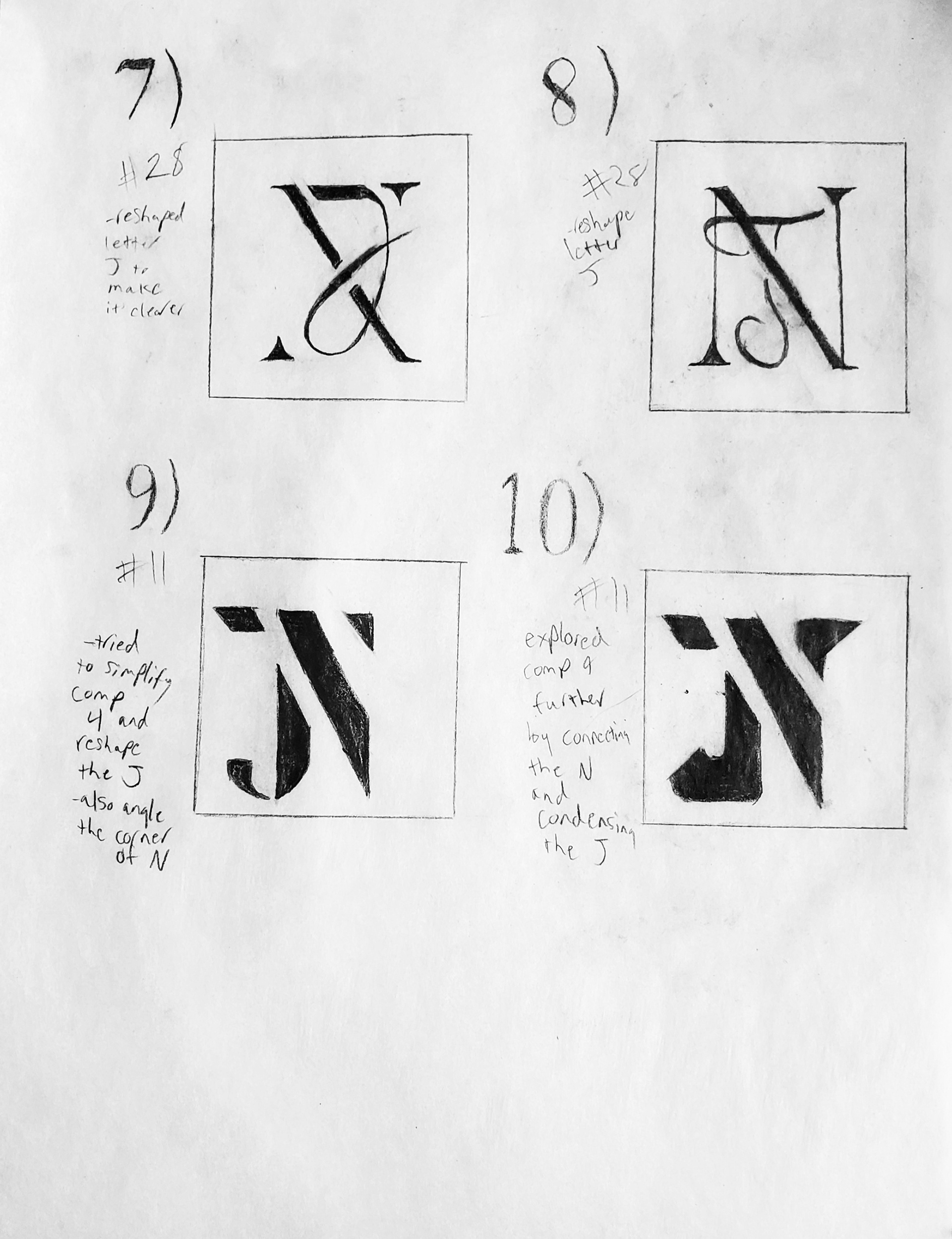


With my monogram narrowed down, I had two distinct styles I could experiment with in Adobe Illustrator. I wanted to modify aspects of the monogram and see what worked and what didn't work. I experimented with parts of the letter such as the serif of the J and how space interacted with the letter.

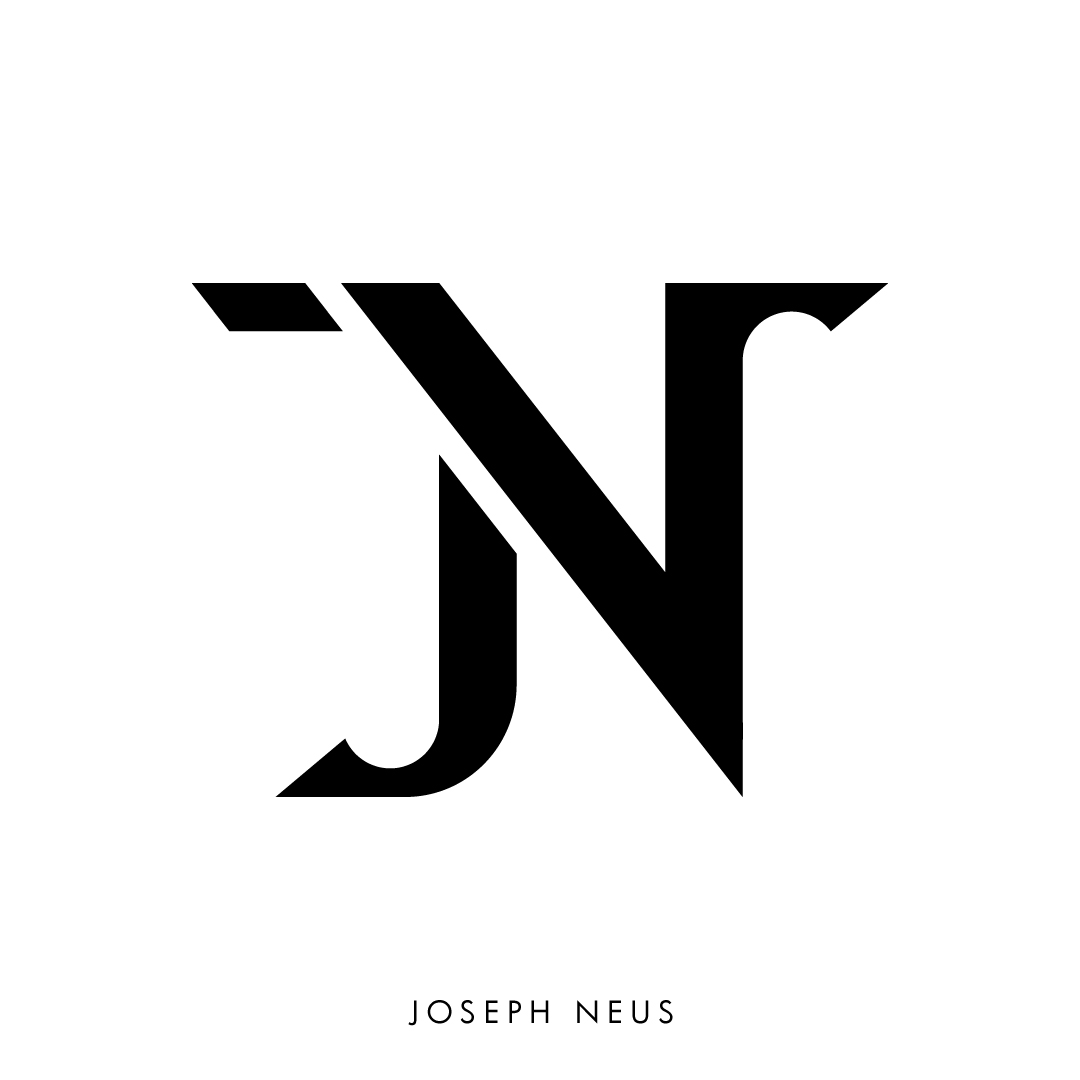
After choosing a design, I began to finalize and digitally refine it with a grid tool in Illustrator. I examined the number of points and managed my vectors for cleaner and simple letterforms.

This was my finished product in a black and white version as well as a color version.
In 2021, I revised my design further by looking for areas of improvement and how I can simplify my monogram to create a more concise and clear design.